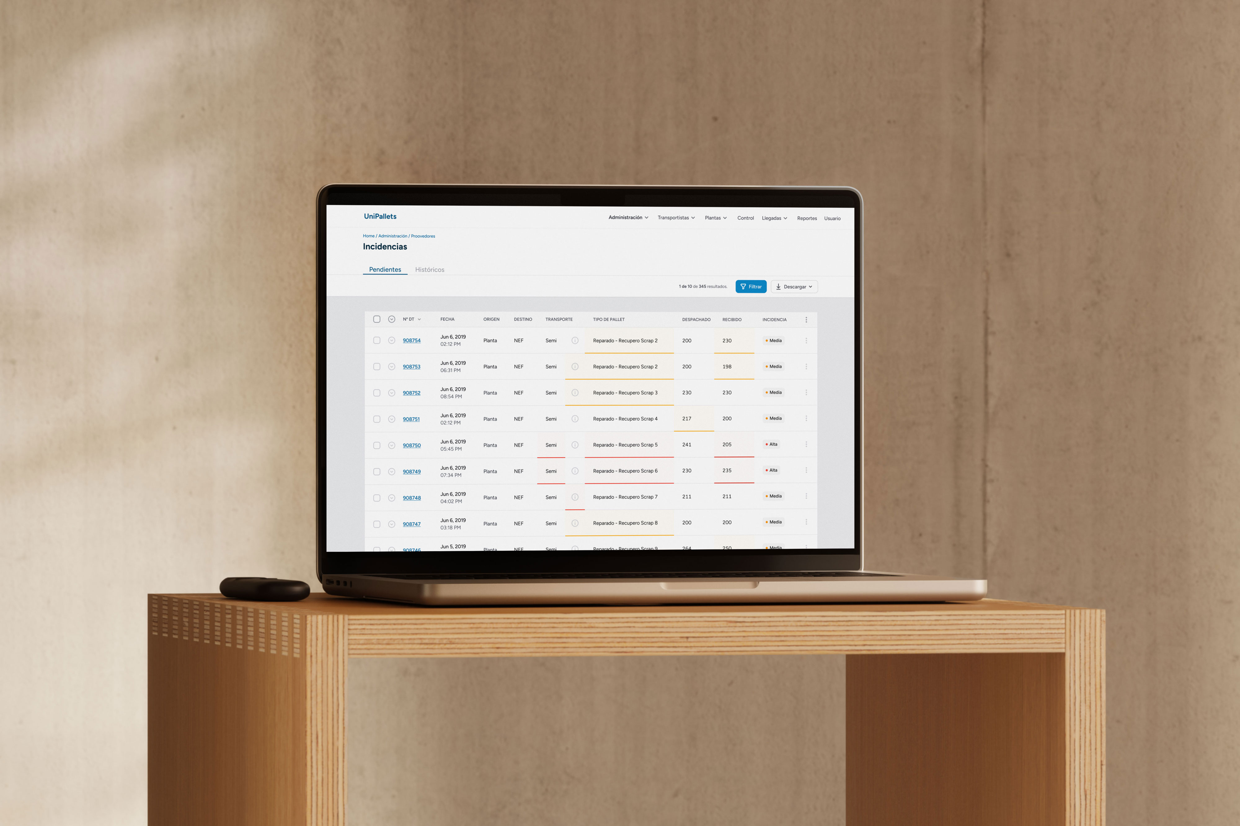
Building Argentina's first unified banking wallet: From zero to 3 million users in 10 months
My Role
I joined as a Founding Product Designer and owned the P2P (peer-to-peer) experience — money transfers. For the first six months, P2P was one of only two pillars of the app.
I also contributed to acquisition flows, merchant payments, account linking, and the design system: ran usability tests and interviews, worked with data engineers to track user behavior, and wrote integration guidelines for the 30+ banking apps that built on MODO's features.
What I Did
I worked to reduce friction and build habitual use through features like:
Suggested contacts
Personal QR code
Push notifications
Push provisioning, on both the standalone app and the partner banking apps
Product Details
text
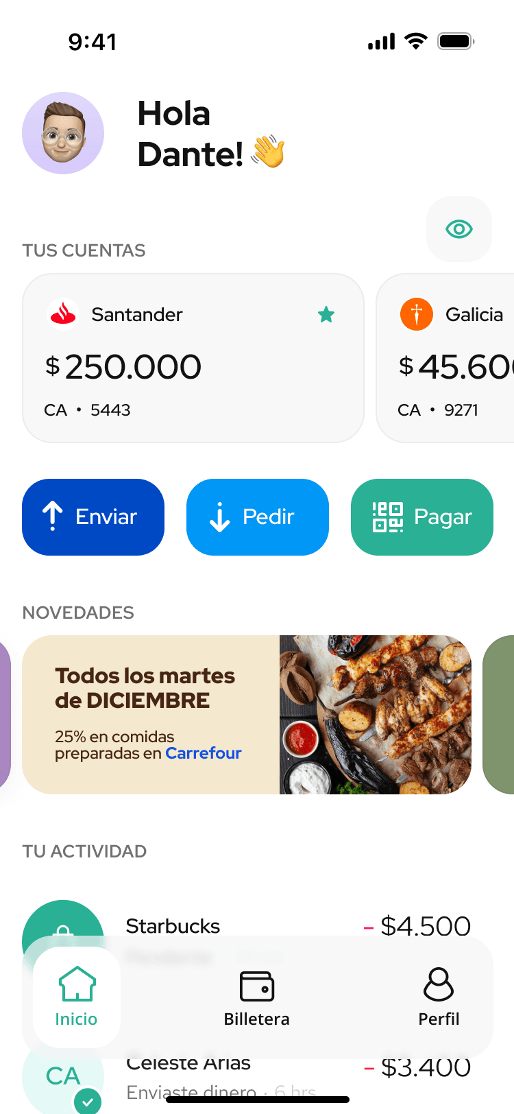
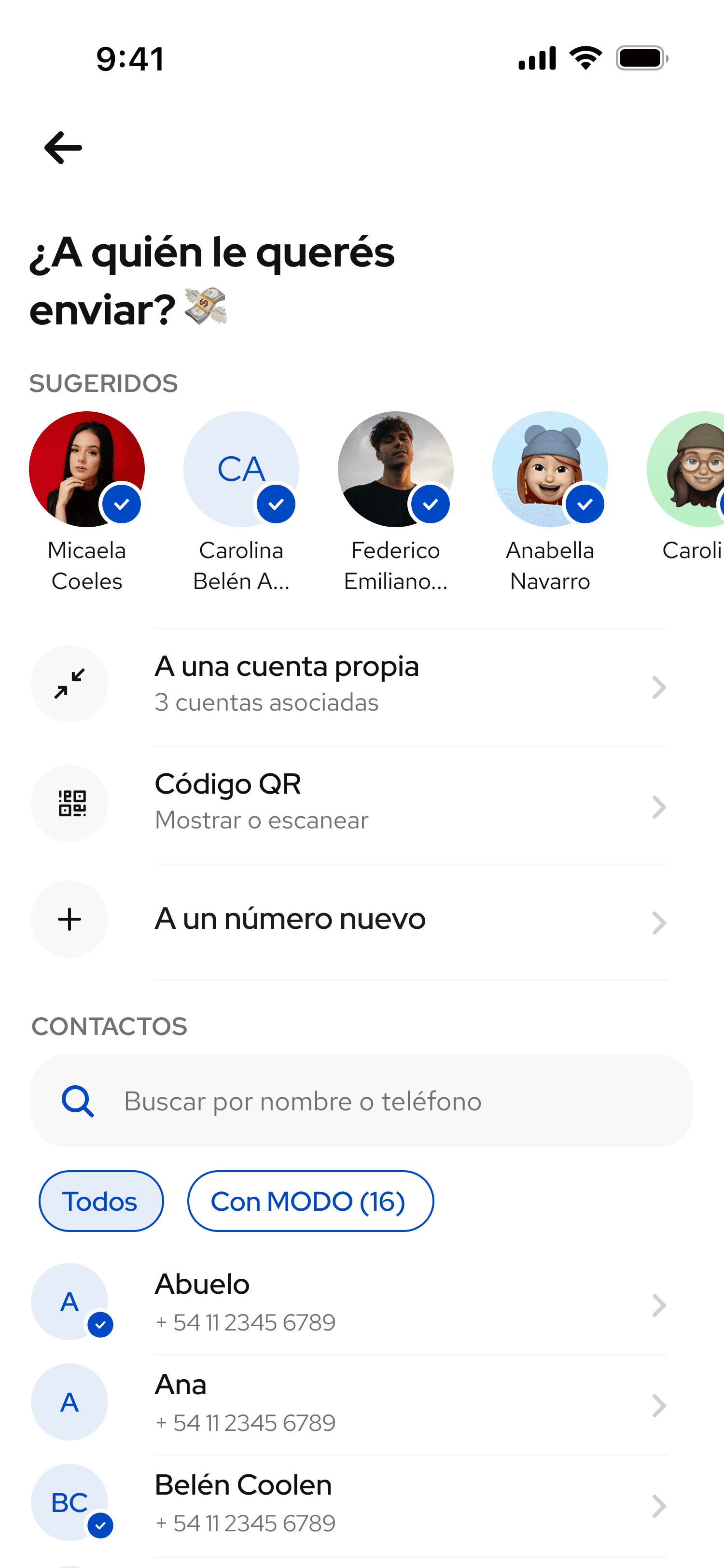
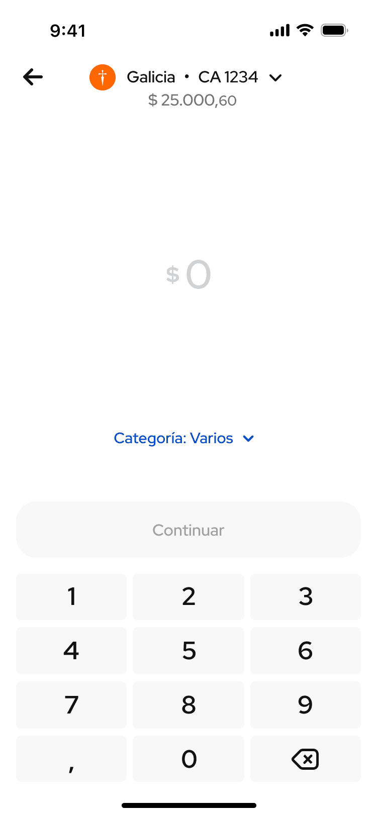
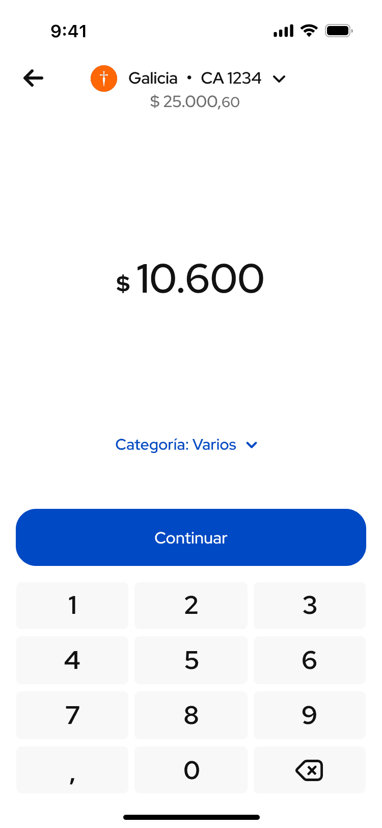
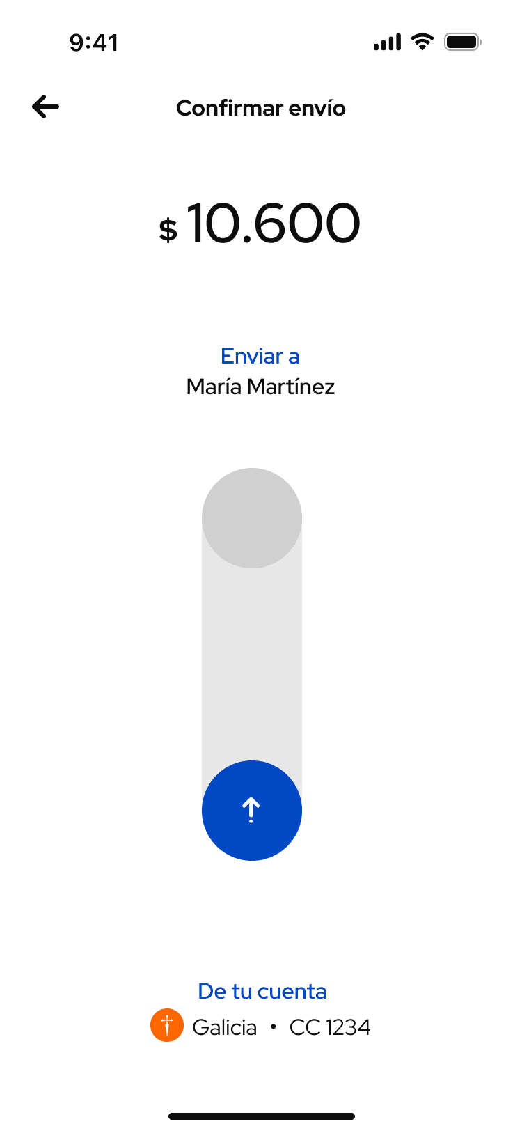
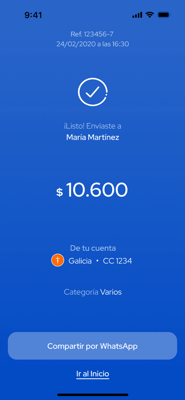
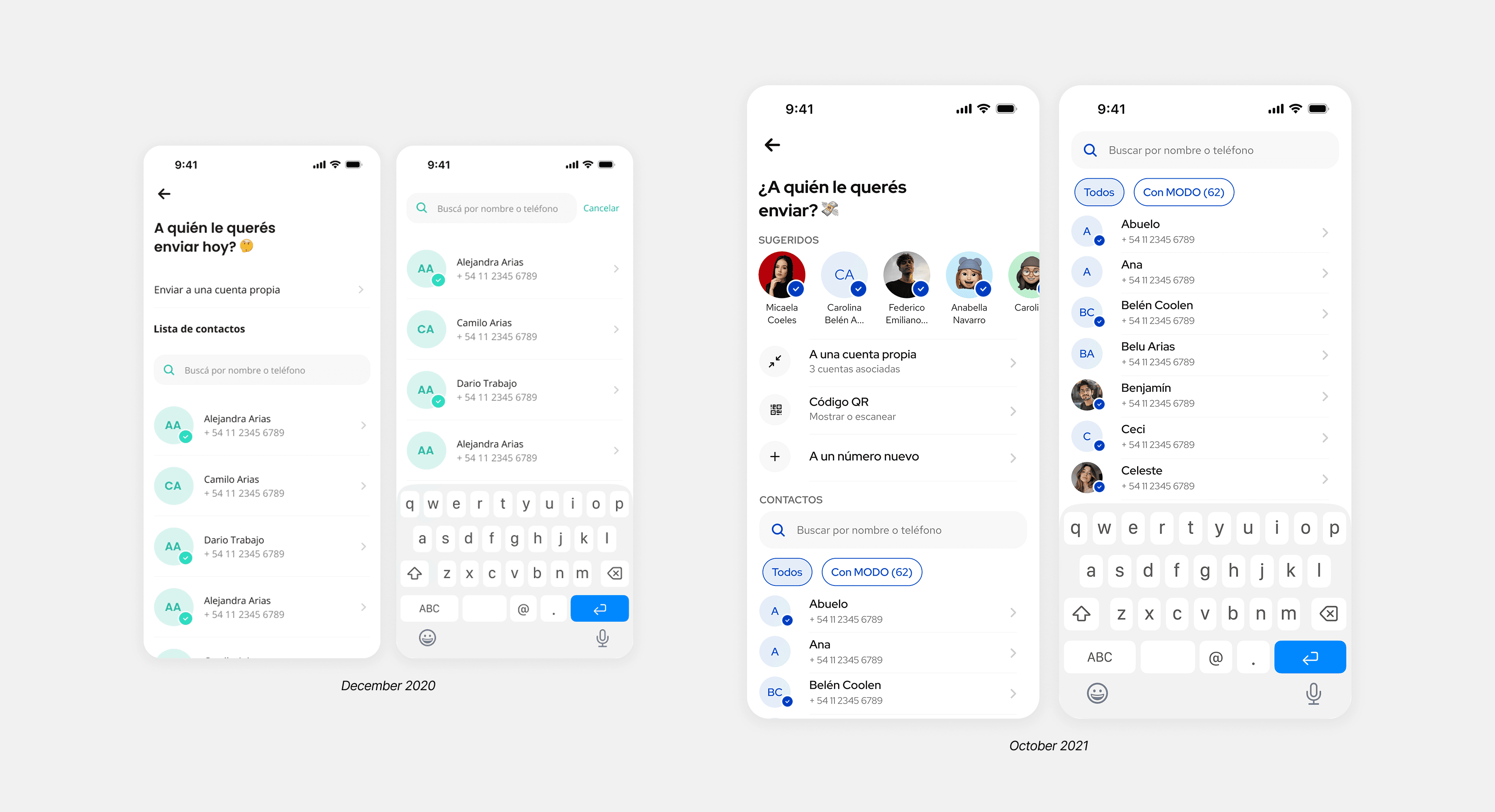
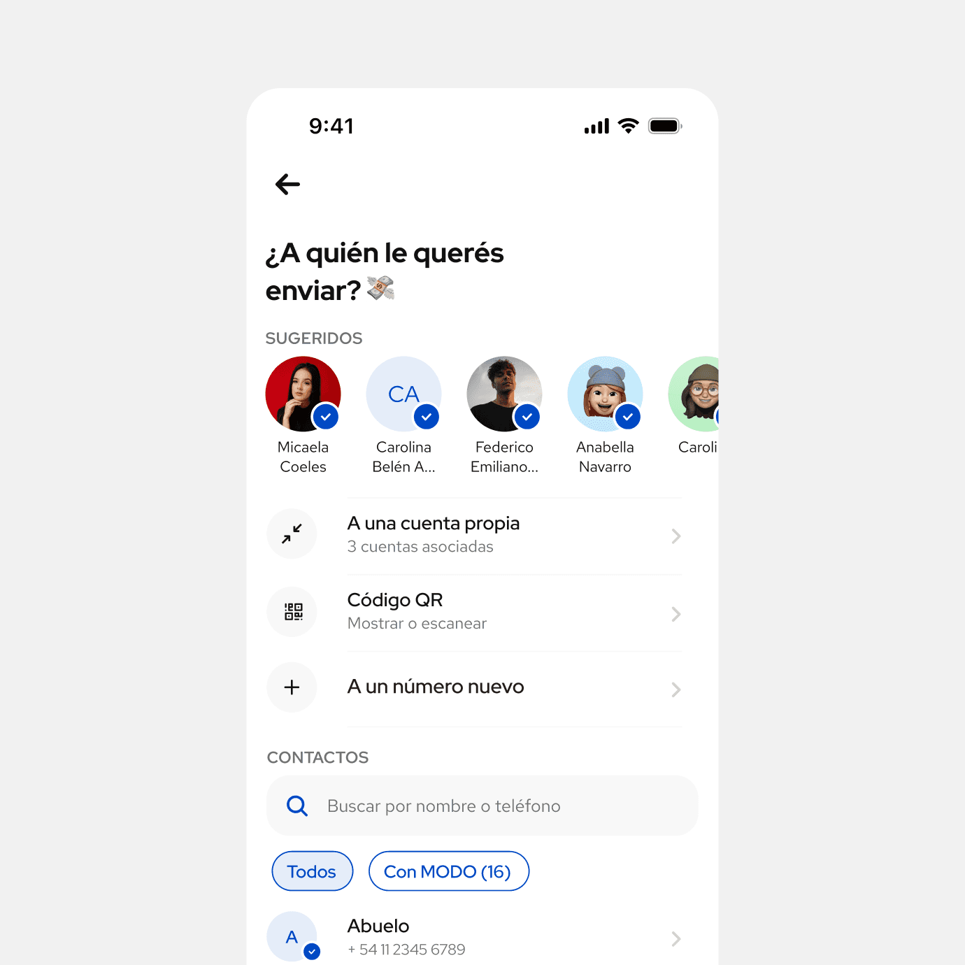
The Contacts screen (see below) was the main entry point into P2P, over the first 10 months, I reworked it alongside the design system.
A few of the numbers behind that work, some directly from the P2P features I owned, others reflecting MODO's growth as a platform during my time there.
Payment Slider
Confirmation
Problem
How do you confirm a payment in a way that feels intentional and still differentiates MODO from every other banking app?
What we did
We designed a vertical swipe-up gesture instead of the standard tap-to-confirm button. The interaction included micro animations, sound, and haptic feedback to make the moment feel real, not just functional. It also made accidental confirmations nearly impossible.
The swipe became central to MODO's identity and differentiate it from other competitors at that time.
Suggested Contacts
Problem
Even with a search bar, finding someone to send money to required real mental effort. You had to think of a name, type it, and scan results, every time.
What we did
We added a row of suggested contacts at the top of the screen — people the user had already transacted with across the MODO ecosystem, no matter which banking app they used.
Result
Users with suggested contacts completed transfers about 30% faster.
Additional notes
Early on, we also added a filter showing which contacts already had MODO.
This mattered because tapping on someone without MODO would leave the transfer pending. Showing it upfront set the right expectation.
We considered most frequent or most recent, but we didn't have reliable data yet.
We went with contacts who had consistent transaction history using MODO, a trade off between personalization and accuracy.
Personal QR Code
Problem
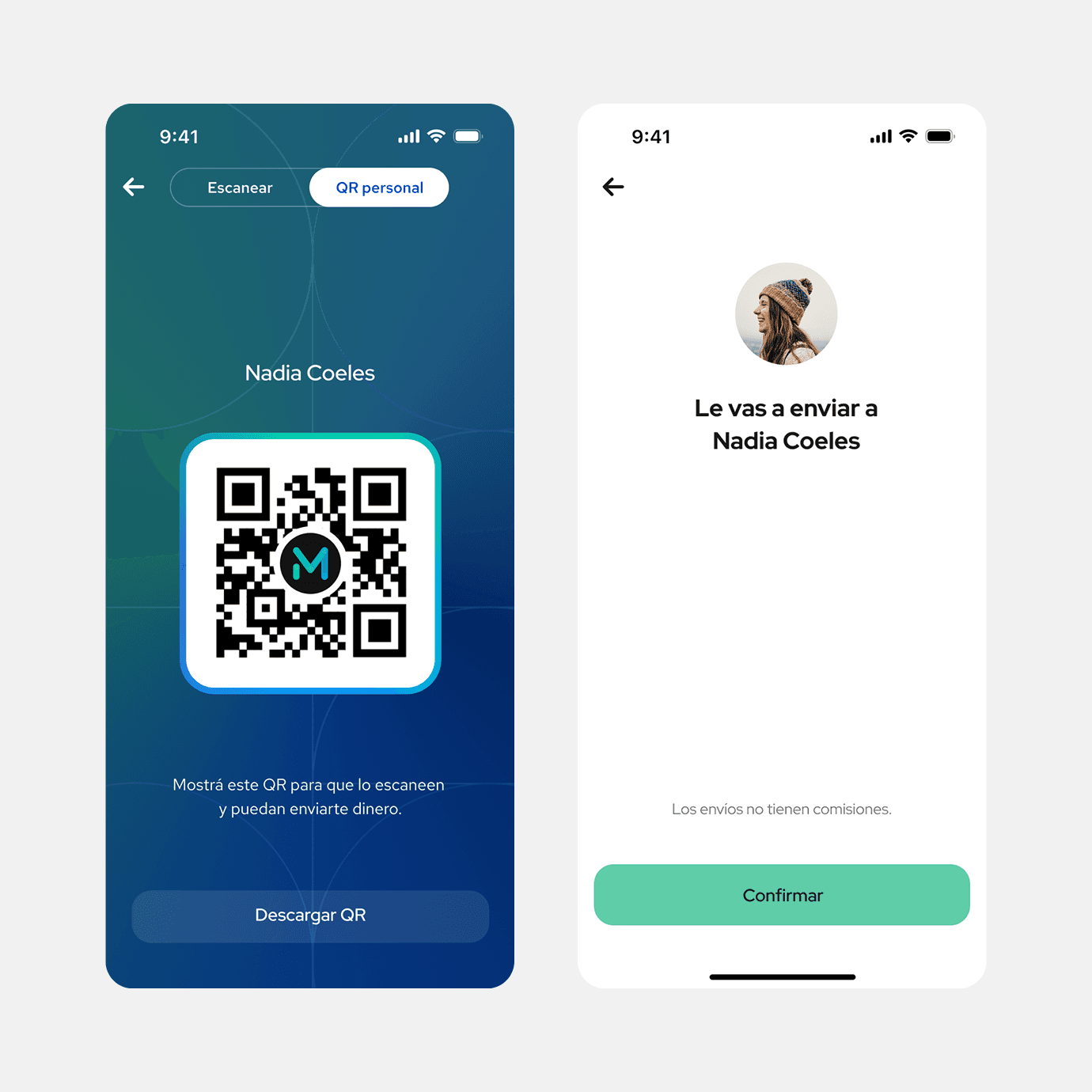
To send money, you needed the other person's phone number. That made spontaneous situations, like splitting a bill with someone you just met, unnecessarily complicated.
What we did
We added a personal QR code each user could show from their profile or the Send flow (Contacts screen). For the MVP we kept it separate from the merchant scanner to avoid a bigger backend commitment, and to prove the hypothesis before justifying the larger investment.
Result
Within weeks, around 10% of users sending money were using the personal QR. We also noticed small merchants starting to adopt it, something we hadn't planned for. That told us the feature had more reach than we'd scoped, and opened the door to expanding it beyond P2P and eventually merging it with the merchant scanner into one.
Push Notifications for Received Money
Problem
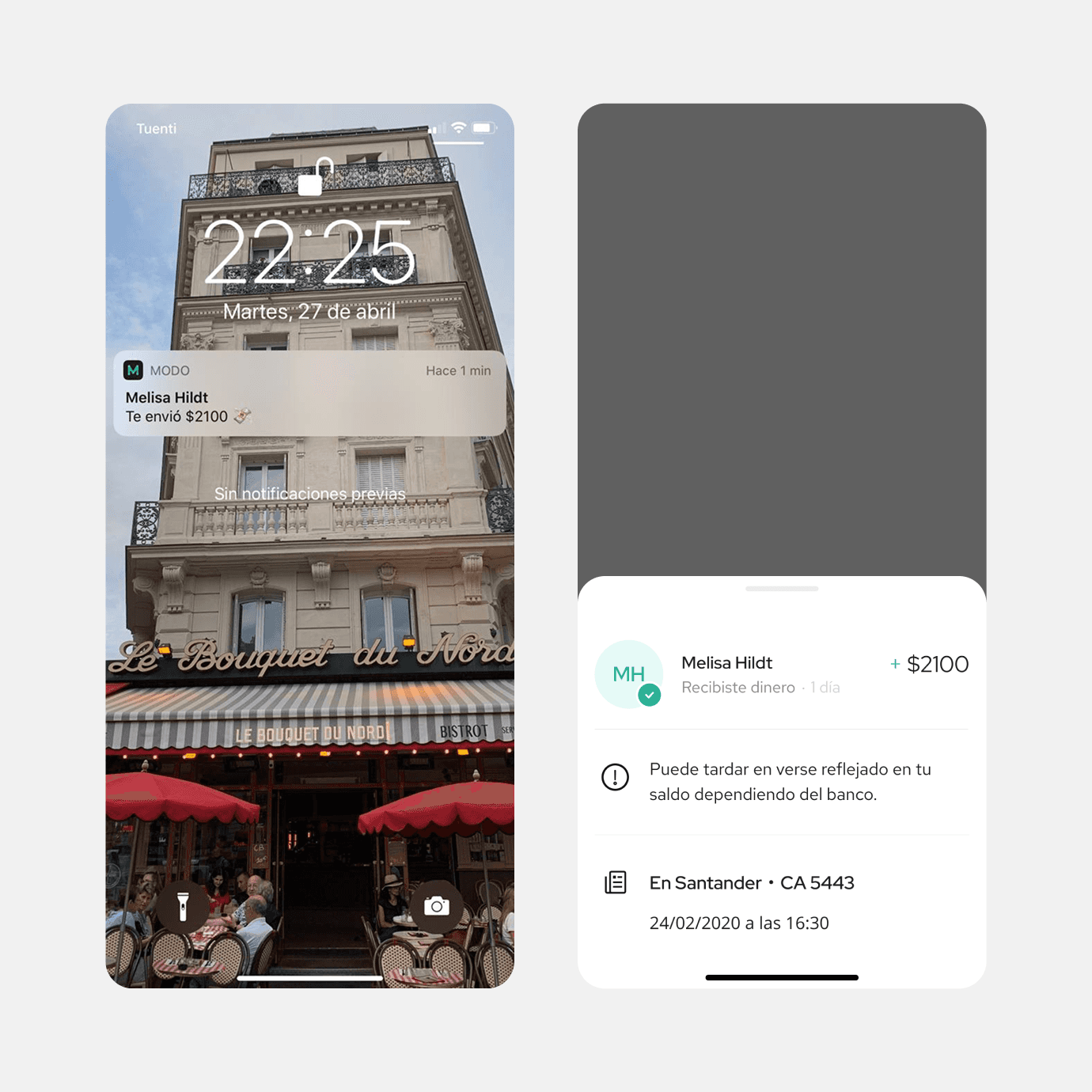
Most banking apps at the time didn't notify users when they received money. The only way to know was to open the app and check, or wait for a message from the sender.
What we did
We added push notifications for received transfers and tracked open rate in the first month to measure interest. After launch, the "notify via WhatsApp" button inside the app got fewer taps, users didn't need to send manual nudges anymore.
Additional note
The tricky part was timing. MODO knew when a transfer was initiated, but not always when it fully settled. We had to write the notification copy carefully to avoid telling someone they received money before it had actually arrived.
Requesting Money
When language creates the wrong mental model.
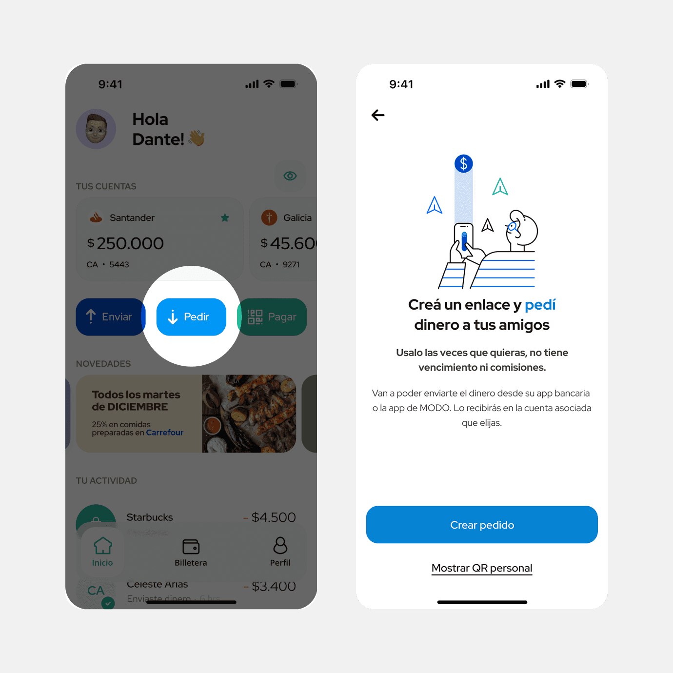
Only around 3% of request links were being paid. At first we started discussing missing features, maybe users needed bill splitting, or didn’t understand the value.
Before jumping to solutions, I went into the database to read what people were actually writing in the subject field. Some entries were what you'd expect, splitting rent, paying back a friend. But I kept seeing: "house renovation," "salary advance," "pay my credit card."
People weren't splitting costs. They were trying to take out loans.
The feature was designed to feel casual, pedido de dinero, "money request." But in a banking context, that language sent the wrong signal. I designed an educational screen before the amount step, reinforcing that this was for requesting money from friends, not applying for credit. It also laid the groundwork for adding new features to the flow down the line.
This learning it was a good reminder to look at the actual data before assuming you know the problem, especially since some of those features lived in other bank apps.